What’s intriguing for the silver chart is the “rare of rarest price pattern.”
From the March low, here is the performance scorecard of gold v/s silver:
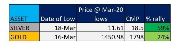
This table clearly tells us that silver has managed to outperform gold from the Covid-19 correction. The white metal has managed to close at fresh quarterly high after almost four years, which by itself is a major feat. In fact, more than a feat, it’s a statement.
What’s all the more intriguing for the silver chart is the “rare of rarest price pattern.”
Silver has just formed a Double Flag Pattern. Flag patterns are generally supposed to be first stage of a bullish setup. If and when they form perfectly, it could be first signal of a new price trends. Now if one flag can result one powerful new trend, imagine what could a Double Flag pattern be capable of.
Conclusion: There is currently a rush to buy gold, and literally every Tom, Dick and Harry on the street is advising investors to buy gold. But hey! Silver seems to be the asset class which is witnessing a major pickup. There is a Long way for silver to catch up to the 2011 high of $49-50. But the charts have primed the asset class in a way in which makes it an extremely strong candidate to watch from here on.
ET CONTRIBUTORS| – Last Updated: Jul 01, 2020, 01.31 PM IST